Cibertec | Señaléticas
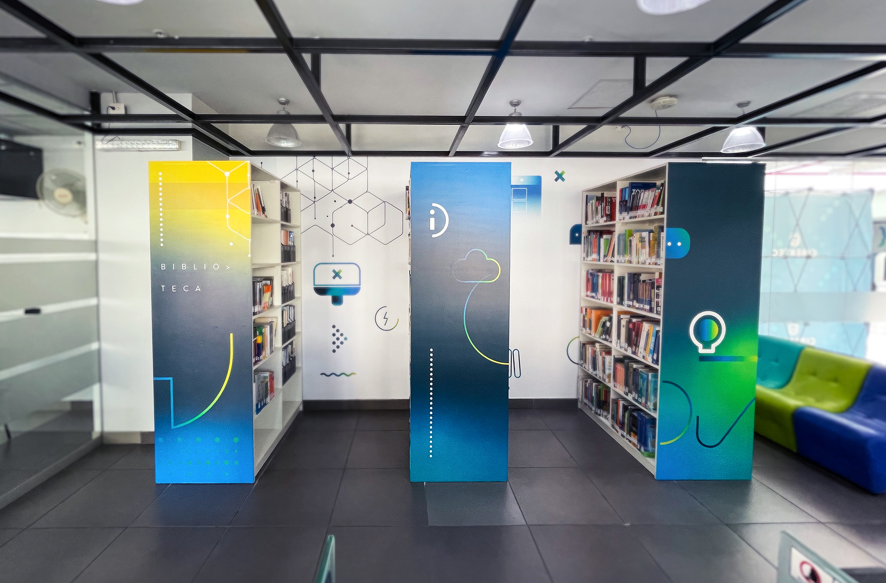
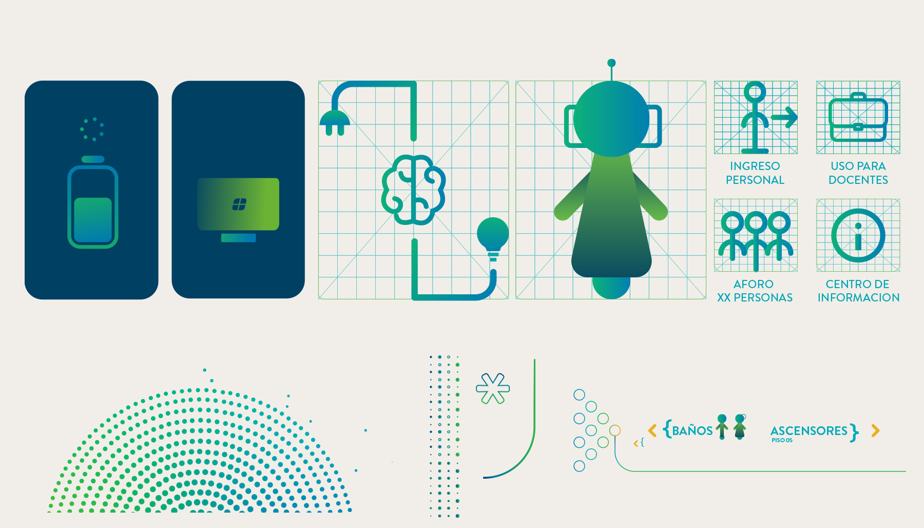
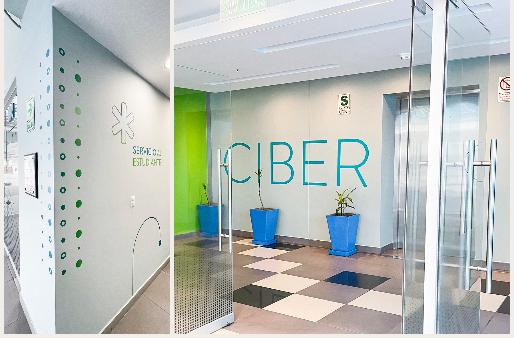
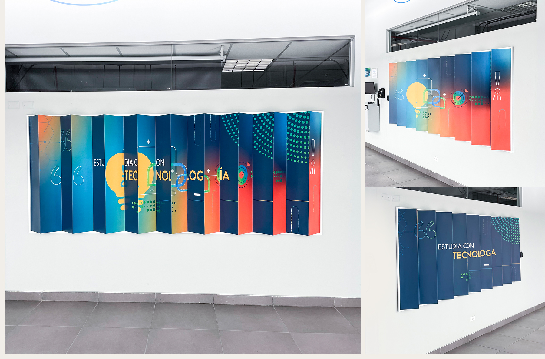
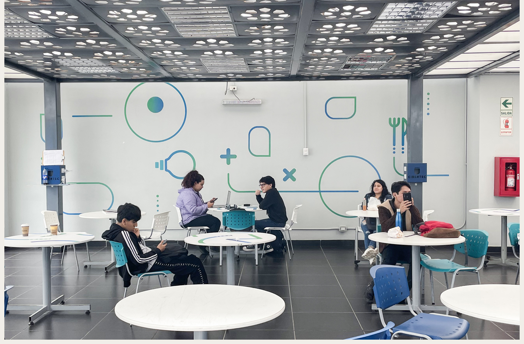
At Vedoble Estudio, we carried out a transformation of the signage system for Cibertec, an educational institution characterized by innovation and technology. We took on the challenge of implementing signage that adapts to its new image, architecture, and the specific needs of each of its five campuses. We worked with the focus of providing students with a welcoming experience, allowing them to feel the ‘tech’ atmosphere that the institution offers while facilitating the location of spaces they need to visit.
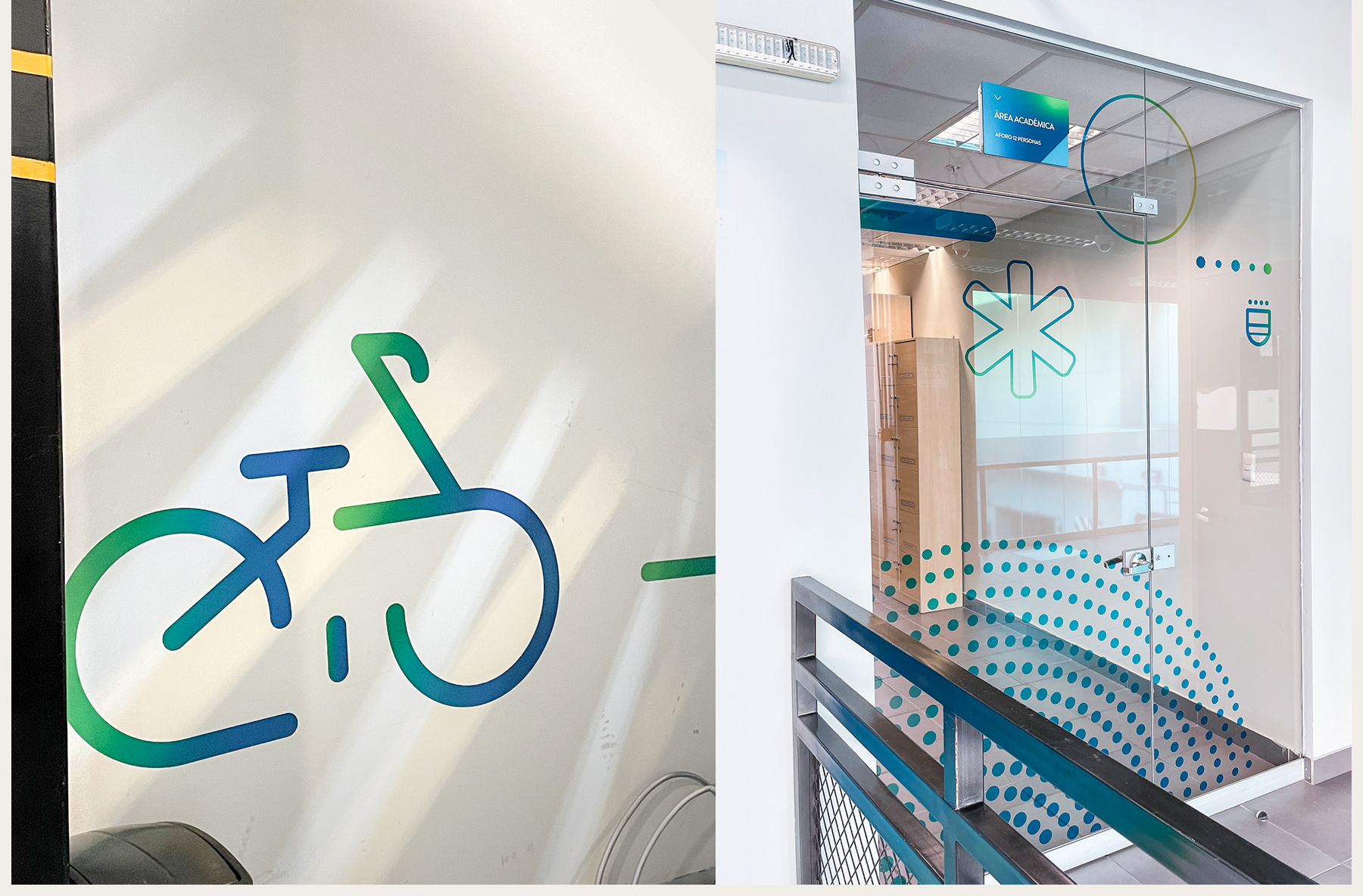
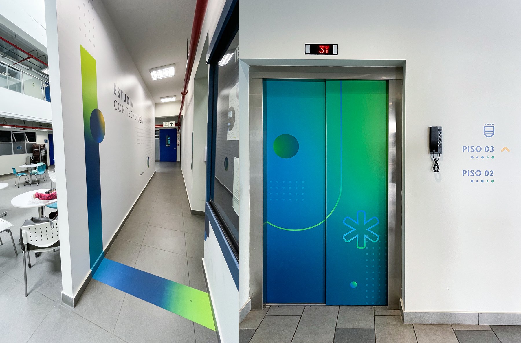
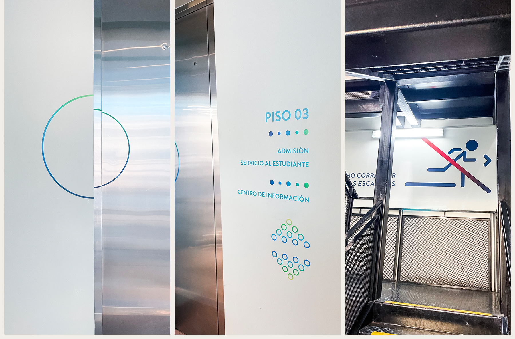
We designed a dynamic graphic language, ensuring optimal legibility and integration with the architecture of the campuses. The central elements of this graphic language consist of dots and numbers designed for each floor. This creates a gradual graphic system representing the organic flow of technology.
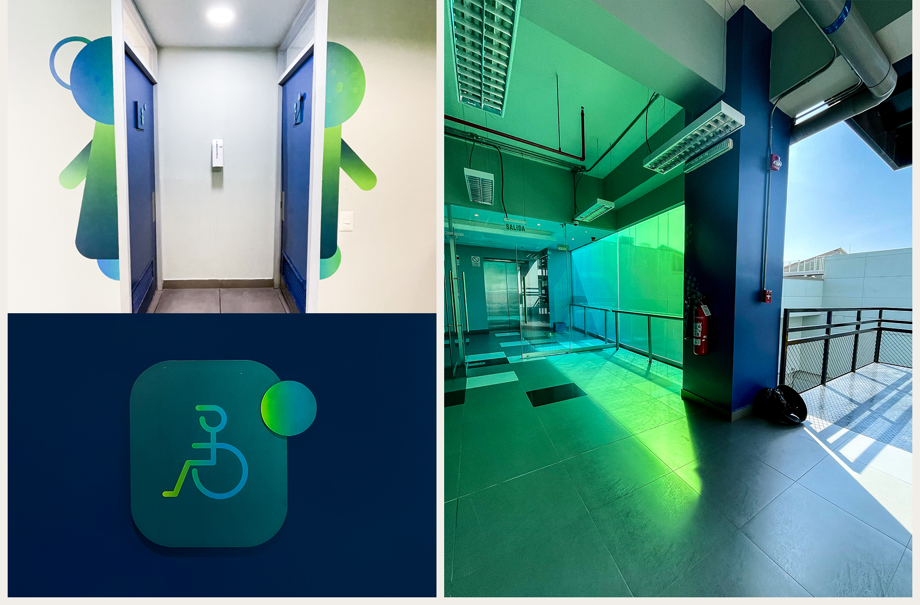
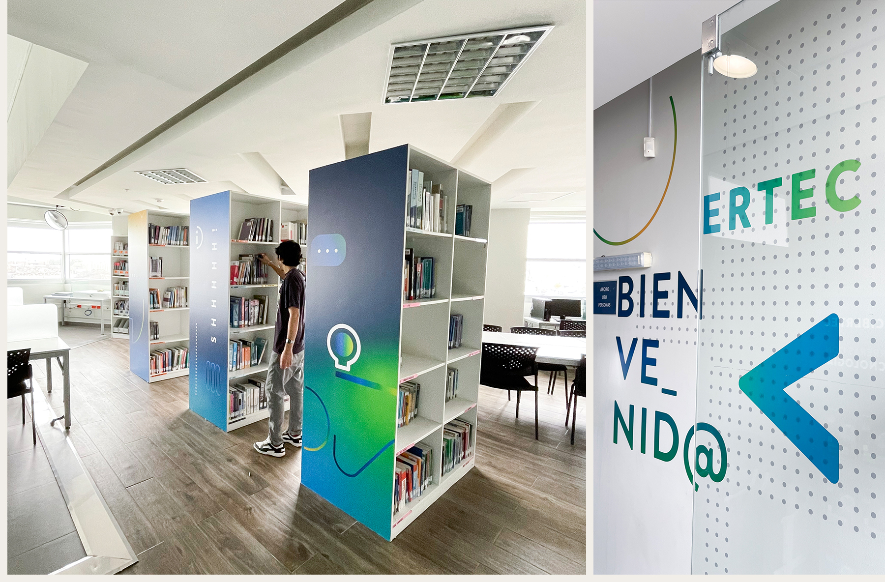
The signage system adopted the same color code defined for the overall graphic system of the environment, creating visual coherence between classrooms, hallways, stairs, and corresponding signage. The predominant colors are vibrant blue and green, both representative of Cibertec. We respected the original color palette and expanded it to achieve the gradual tones symbolizing the continuous changes in technology.
This innovative signage concept, developed for Cibertec, has been implemented comprehensively across all its campuses, seamlessly adapting to the architecture and specific operational needs of each.
