Toulouse Lautrec | Editorial
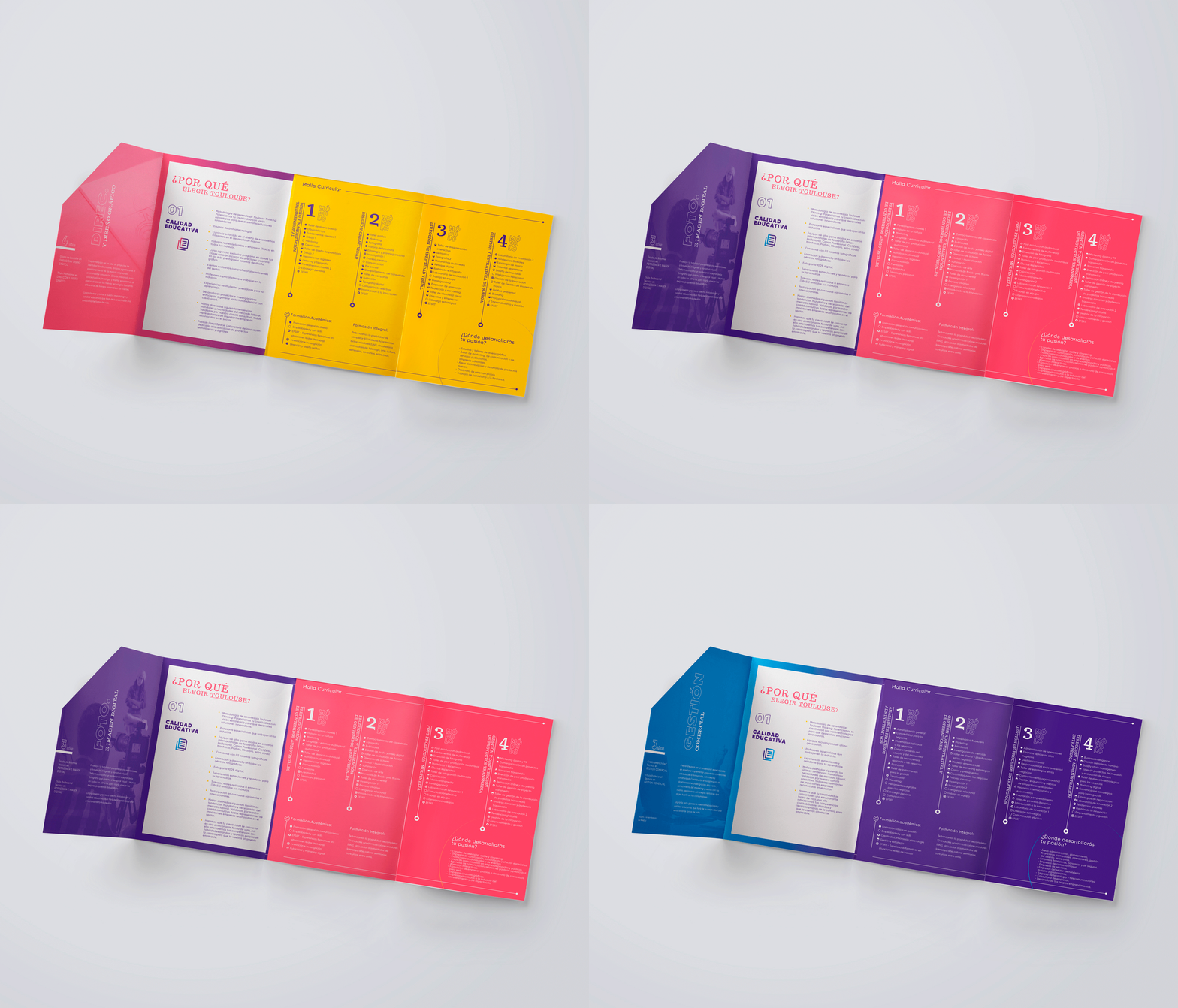
Toulouse Lautrec commissioned us to redesign the brochures for its entire portfolio of courses. The challenge was significant as we had to adhere to the new identity system while giving each course its own personality. Additionally, Toulouse had to introduce its new Business School to the public, embodying the brand’s values and personality while being empathetic to its new target audience—prospective students interested in Business courses.
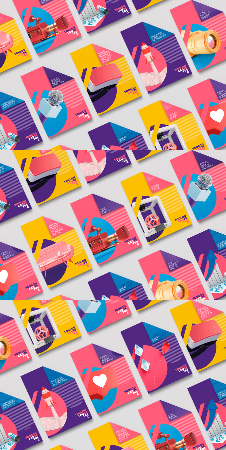
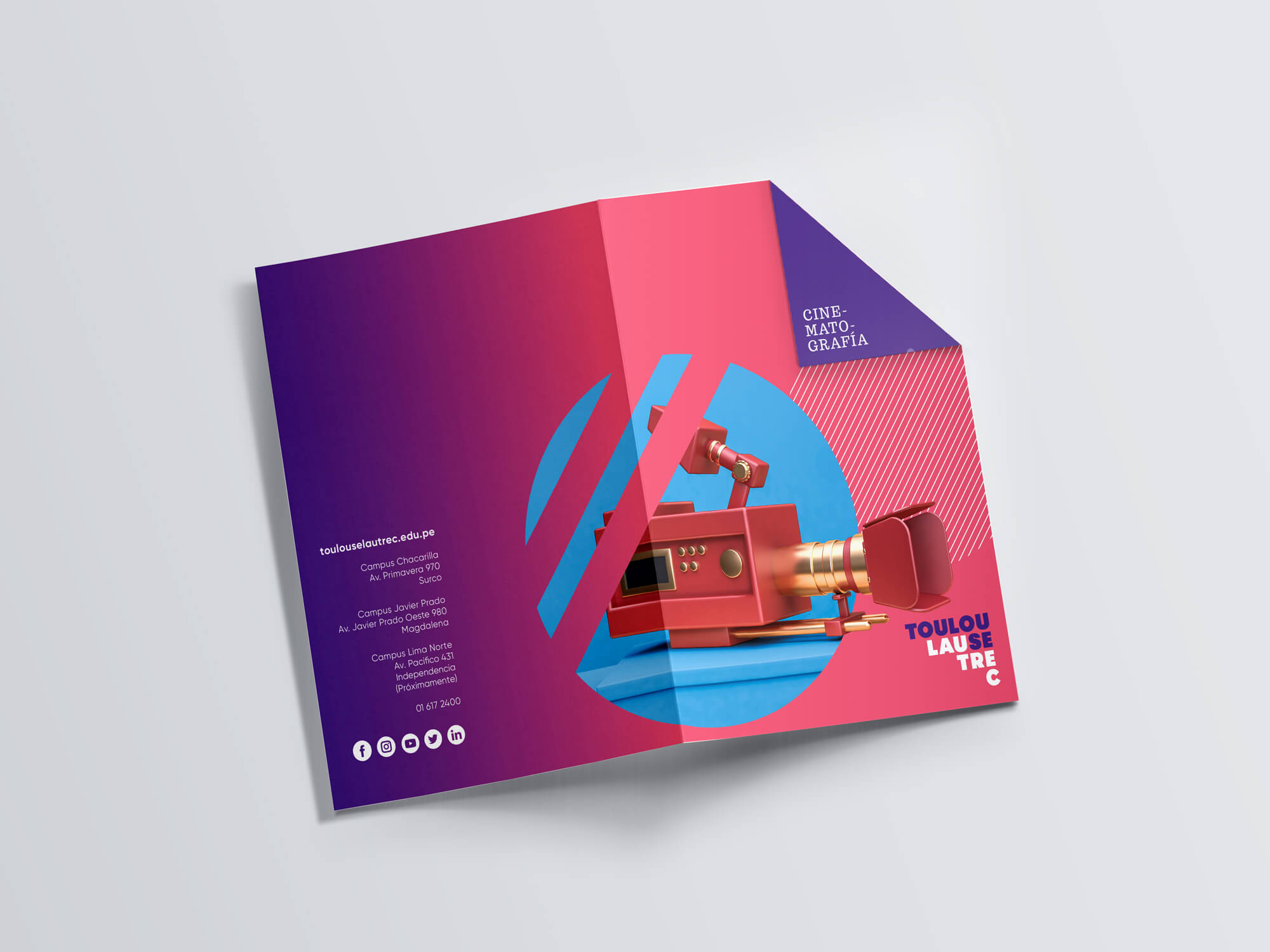
Toulouse is a brand with a bold identity, especially due to its vibrant color palette, allowing it to stand out from the category. This boldness inspired us to create an innovative format; the brochure had a folded tab in one of the corners. At first glance, it appeared to be a typical brochure, but this simple detail made all the difference. The covers were also highly conceptual and full of color, further accentuating the brand’s freshness.


