Toppings Leite | Packaging
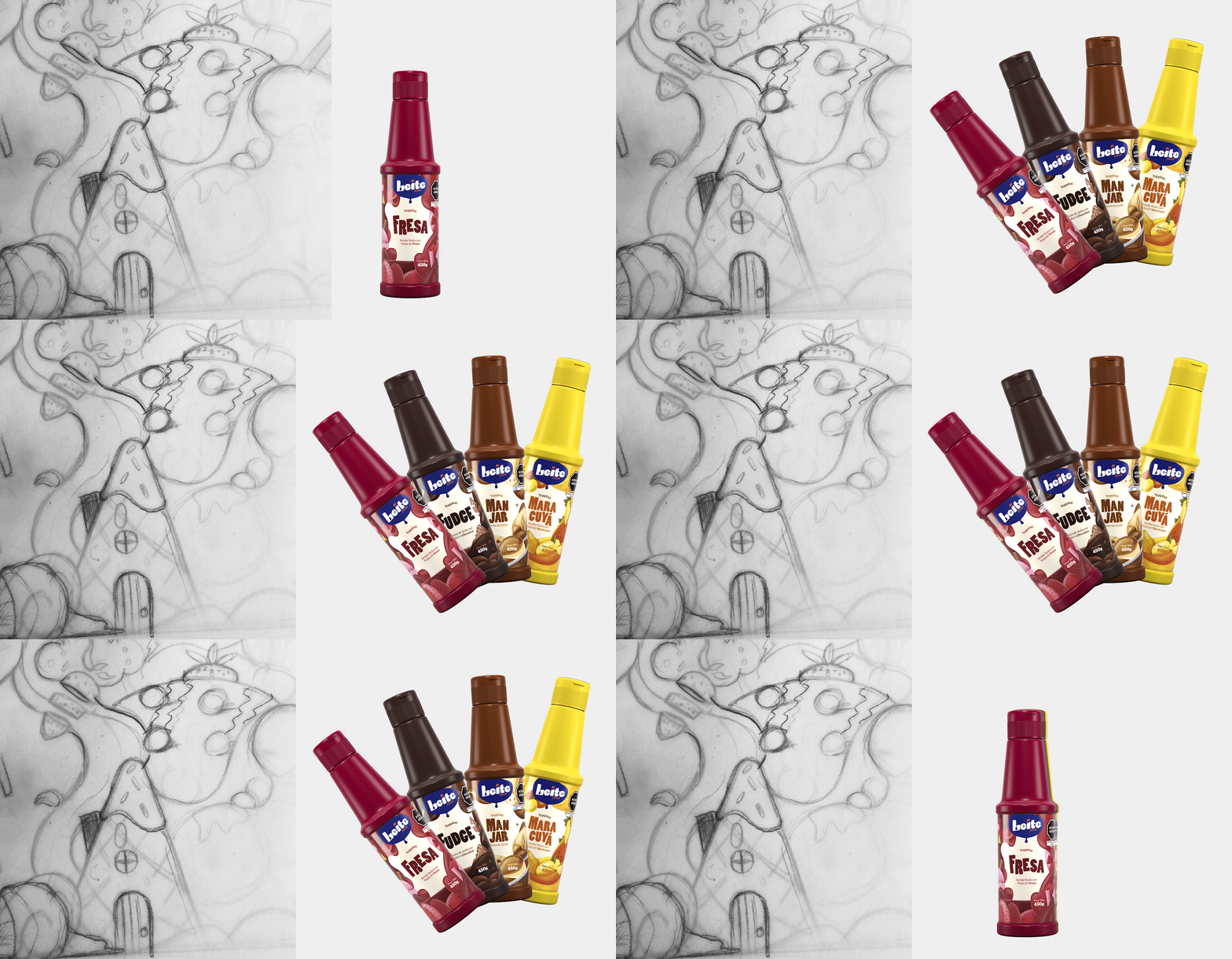
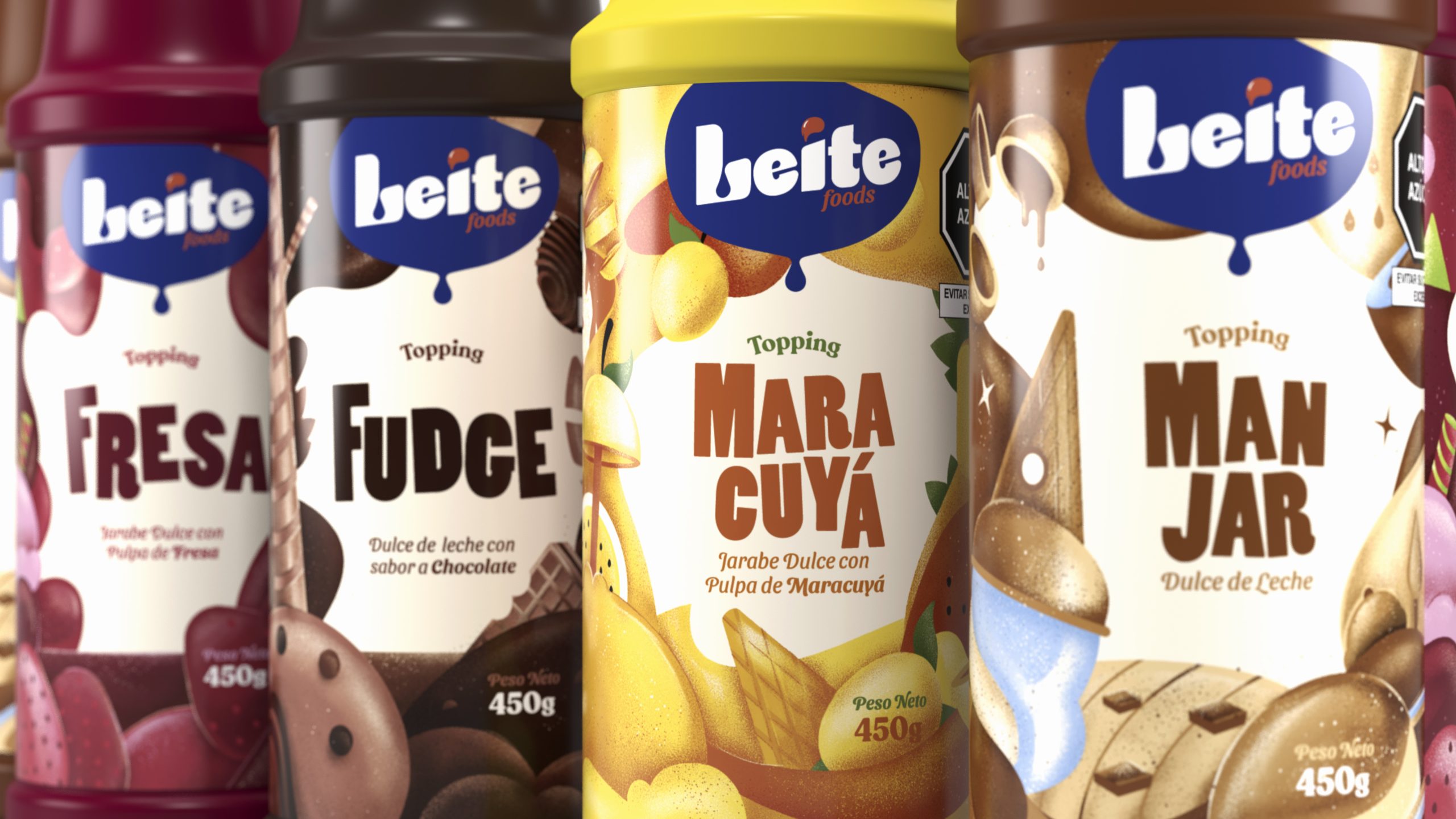
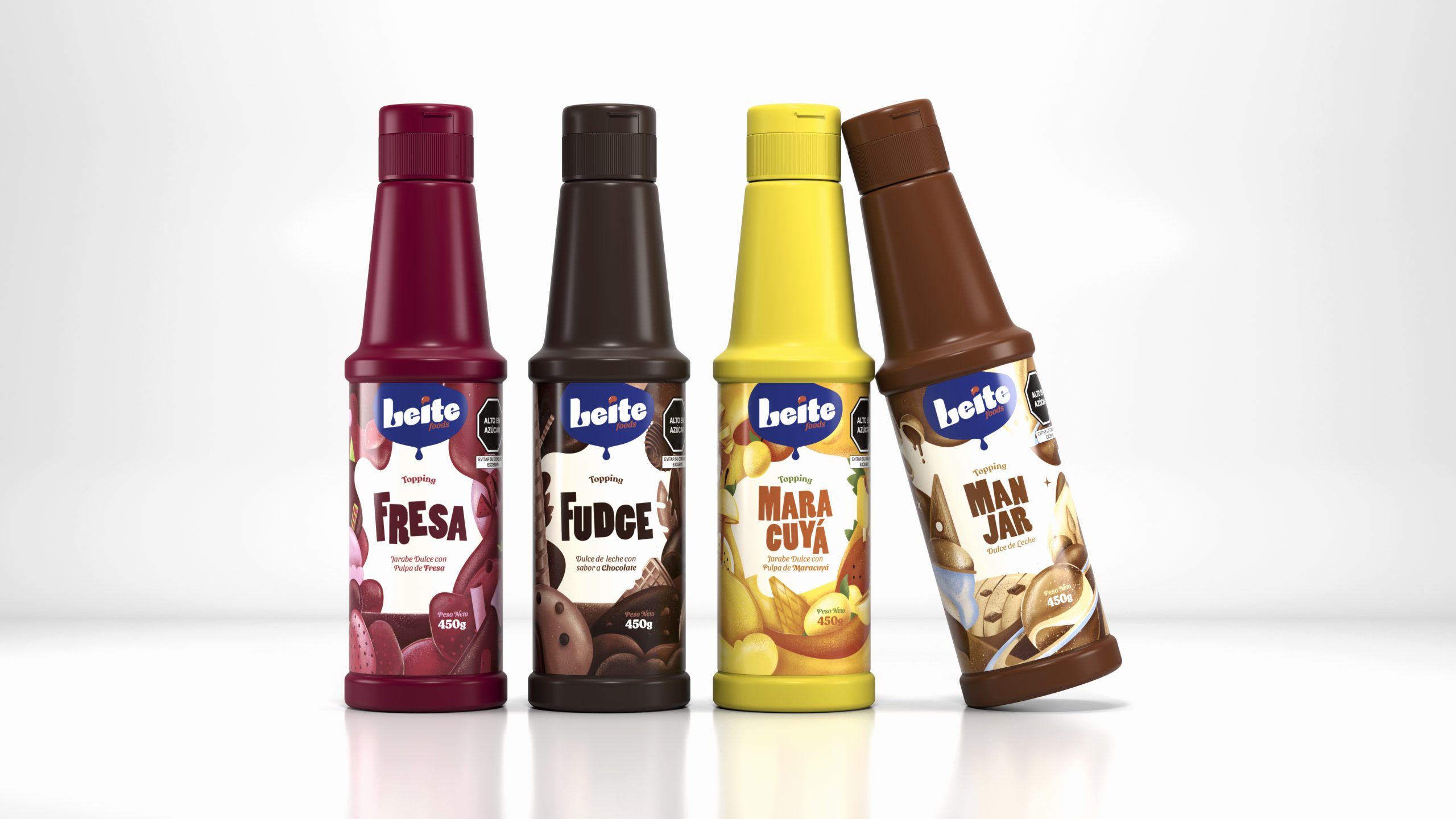
Manjar Leite is a Peruvian pastry and dessert brand that has been offering dessert ingredients for over ten years, primarily targeting the B2B sector. However, with the aim of expanding its market to also reach the end consumer, Manjar Leite introduced a new product: Toppings. These are liquid products that serve as an extra ingredient to decorate and add an additional flavor to desserts. At Vedoble Estudio, we took on the challenge of designing the packaging for their four flavors: Strawberry, Mayacuyá, Fudge, and Manjarblanco. We knew that to do this, we had to create designs that are approachable and friendly, helping to elevate the brand perception. That’s why we used illustrations as a resource, allowing us to create a universe for each flavor with multiple strokes.
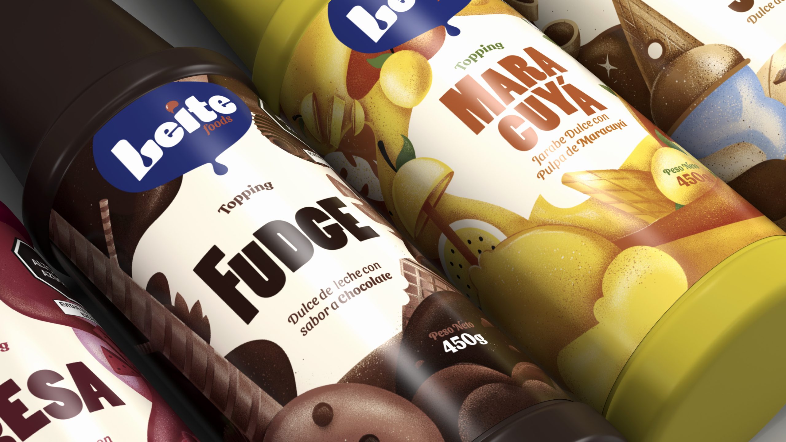
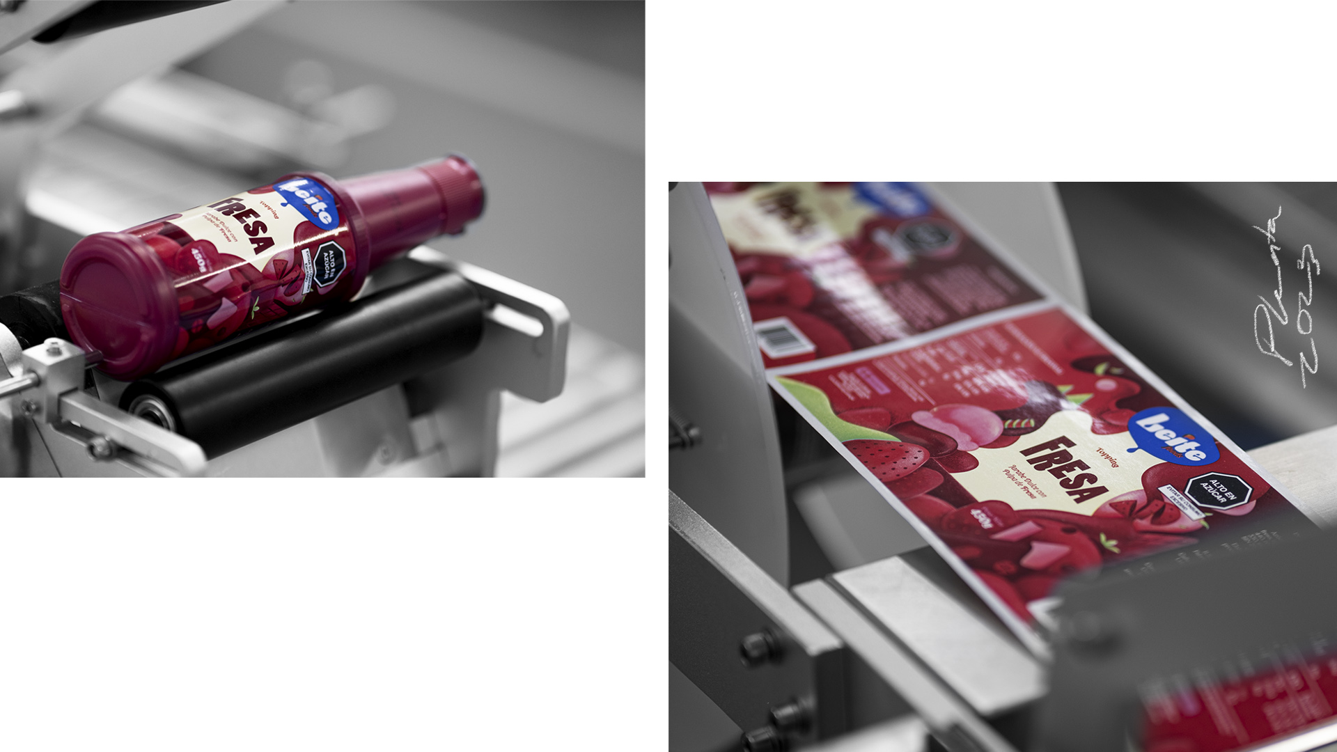
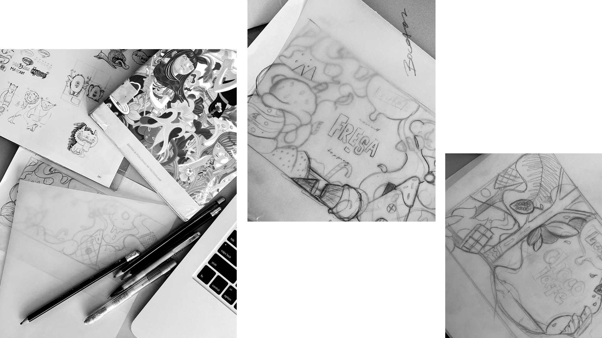
Our main objective was to stand out on the shelves and differentiate ourselves from the classic bottles of similar products. Therefore, we started by selecting bottles with vibrant colors, which we covered with a hand-illustrated label, highlighting the innovative ingredients used for preparing the toppings, accompanied by the brand’s logo. The illustration process for the labels was very careful and detailed, creating a visual universe for each of the four flavors, each with its own essence, yet all four communicate graphically.
The illustrated labels consist of textures and a representative color palette, so each one tells its own story. In the Manjar world, we emphasized the soft tones and dairy ingredients that characterize this classic flavor. For Fudge, we illustrated the jungle where cocoa trees grow, using intense and vibrant colors. The Maracuyá world represents tropical exuberance with fresh and exotic ingredients, while in the Strawberry world, we highlighted red and juicy tones to represent sweetness.
